

BRAND IDENTITY
A visual identity built around protection, resilience and practical performance.
KameLo’s brand identity reflects the environments workers face and the protection they rely on every day.
From color to symbol, each element is designed to express dependable safety, durability and purpose.
THE IDENTITY of KameLo
The identity of KameLo is designed to communicate protection, reliability and real-world performance. It represents the brand’s commitment to safety and its practical approach to demanding work environments.
KEY COLOR
KameLo’s signature Yellow Orange represents visibility, confidence and a bright future for protection. It helps the brand stand out clearly in demanding industrial and outdoor environments.
YELLOW ORANGE
HEX #FFB500
RGB 255 / 181 / 0
CMYK 0 / 31 / 100 / 0
LOGO SIGNIFICANCE
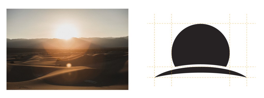
SAND DUNE AND SUN
The sand dune and sun symbolize demanding outdoor environments. They represent the rugged conditions workers face and the exposure that can also become a workplace hazard.

CAMEL
The camel symbolizes endurance, adaptability and dependable protection in harsh environments.

PROTECTION
The protective form represents KameLo’s commitment to safeguarding workers and putting safety first.
BRAND CONCEPT
MORE THAN PROTECTION
KameLo is built on the idea that protection should do more than meet basic requirements. It should support real work through safety, comfort and practical performance.
PROTECTION
Protection designed around
real workplace hazards.
RELIABILITY
Dependable products developed
for demanding environments.
PRACTICAL PERFORMANCE
Protective solutions designed to work
where they are actually used.
OUR GOAL
KameLo aims to deliver protective solutions that workers can trust in real-world environments.
PROTECT WORKERS
We develop protective solutions for demanding industrial and outdoor environments.
SUPPORT REAL WORK
We combine protection with comfort, mobility and practical usability.
BUILD TRUST
We create products and brand experiences customers can rely on with confidence.
BUILT WITH PURPOSE
DESIGNED FOR PROTECTION
A brand identity shaped by real work and real protection.